Hello,
I have included here a Tableau-based visualization presentation of a sample research study that I designed. For a smoother viewing experience, you can use the full-screen option in the bottom-right corner. Since the desktop version is more convenient than the mobile version, it may be preferable for reviewing the presentation.
Some details that may also appear in the introduction of the presentation:
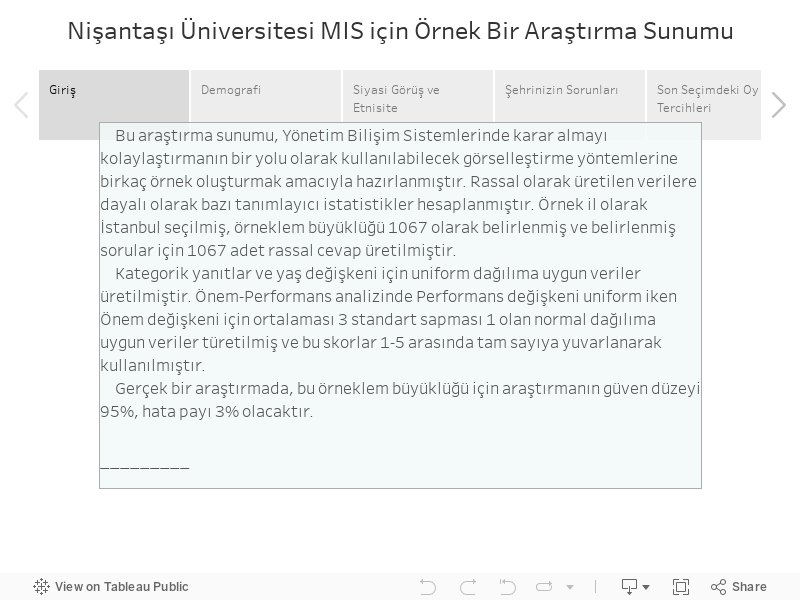
This research presentation was prepared to provide several examples of visualization methods that can be used as a way to facilitate decision-making in Management Information Systems. Based on randomly generated data, several descriptive statistics were calculated. Istanbul was selected as the sample city, the sample size was set at 1,067, and 1,067 random responses were generated for the selected questions.
For the categorical responses and the age variable, data were generated according to a uniform distribution. In the Importance–Performance analysis, the Performance variable was generated from a uniform distribution, while the Importance variable was generated from a normal distribution with a mean of 3 and a standard deviation of 1. These scores were then rounded to integers between 1 and 5.
In a real study, for this sample size, the confidence level would be 95% and the margin of error would be 3%.
Not: If you have trouble viewing the presentation on this page, you can also access the Tableau link here The related work is hidden on my Tableau profile and can only be accessed through this link.